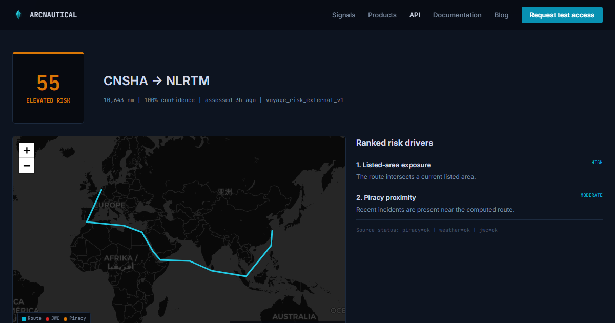
A voyage-risk response is tempting to flatten into one number and a color. That makes a clean table, but it throws away the parts that explain whether the result changed, what caused it, and how much trust to place in it.
The API returns a decision object. This is how to read it.
Score and risk level
score is the composite route-risk value on a 0 to 100 scale. risk_level maps the number into a stable band for display and workflow rules. Use the numeric score for sorting and change detection. Use the level when a user needs a fast label.
Neither field should make an automatic go or no-go decision. The response is decision-support intelligence, and the right action still depends on cargo, vessel, insurance, customer commitments, and the operator's policy.
The assessment has a timestamp
assessed_at says when the underlying route and intelligence sources were evaluated. Always display it. If you compare assessments, compare records produced with the same methodology_version and keep both timestamps.
A useful product message says elevated, assessed 18 minutes ago
or up 9 points since booking
. A bare elevated
label gives the user no way to judge freshness or movement.
Drivers explain the number
The drivers array is ranked by contribution. Each item identifies a source, a plain-language label and summary, an event count where relevant, a contribution band, and three numbers you can compute with. The first two or three drivers usually belong next to the score; the full list can sit in a detail panel.
{
  "source": "jwc_listed_area",
  "label": "Listed-area exposure",
  "summary": "The computed route intersects a current listed area.",
  "event_count": 1,
  "signal_score": 82,
  "weight_pct": 15,
  "contribution_pct": 21,
  "contribution_band": "high",
  "sets_floor": false,
  "relative_rank": 1
}
The three numbers answer different questions. signal_score is how severe that one signal is on its own, from 0 to 100 — it says nothing about how much the model cares. weight_pct is how much the model cares: that driver's share of the model, summing to exactly 100 across the full driver list. A signal can score 90 and still carry an 8% weight, which is precisely why rank alone is not enough to build a threshold on.
contribution_pct is the two multiplied and normalized: how much of this assessment that driver accounts for. It also sums to 100, and it is the number to chart when you want to show what a score is made of. contribution_band is a coarse cut of it — critical at 30% or more, high at 20, medium at 10 — so a rule can branch without picking its own thresholds.
The band is relative to the assessment, not a severity scale. A driver can band critical on a quiet route because it is most of what little risk there is. Branch on score and risk_level for how dangerous the voyage is, on signal_score for how bad one signal is, and on the band only for what the result is made of.
What none of the three gives you is the composite arithmetic. Do not expect signal_score and weight_pct to multiply out to score: the engine renormalizes across the signals that actually returned data, and a categorical fact can set the score outright. Use these numbers to explain relative influence, not to reconstruct the total.
Rank answers the narrowest question of the four: which observed factors contributed most to this assessment?
Some scores are set by a fact, not by the average
A weighted average cannot carry a categorical fact. This voyage crosses a Joint War Committee listed area
is a yes or a no, and when it is yes the insurance market prices it as war risk whatever the wave height is. Averaged against calm weather and a quiet piracy month, an active war zone reads as moderate — which is wrong in the way that matters.
So three facts put a floor under the score: a listed-area transit, a call at a port in a JWC Named Country, and a transit of a sanctioned state's Exclusive Economic Zone. A listed area where live feeds place hostile activity on the track — a hostile navigational warning, an attack, or AIS and GPS disruption inside that area — floors the score into the high band. The weighted signals still decide everything above the floor.
When a floor applied, the response says so:
"score_floor": {
  "basis": "listed_area_active_hostility",
  "value": 80,
  "explanation": "Route transits Southern Red Sea — a JWC listed area with active hostile activity on this track.",
  "weighted_score": 61
}
The field is absent when the weighted signals decided the score by themselves. When it is present, treat score as the verdict and weighted_score as the comparator: two lanes through the same active war zone are both high risk, and that is the honest answer, but their pre-floor numbers still tell you which is worse. basis is a stable enumeration, so an alerting rule can single out listed_area_active_hostility without parsing English.
The driver that owns that fact carries "sets_floor": true, and it always bands critical. This is the one case where the band is not a cut of contribution_pct, and deliberately so: when a floor is in force the published score follows from that single fact rather than from the weighted mix, and a driver list that ranked it on its weighted share alone would tell you the war-zone transit was a middling contributor to a score it set by itself. Highlight that row; it is the answer to why is this number what it is
.
Named entities come as arrays, not prose
Two fields carry the concrete things the route crosses, so you never have to regular-expression them out of a summary sentence. jwc_intersected_areas lists the Joint War Committee listed areas, and eez_transit lists the Exclusive Economic Zones, each with a route_fraction giving the share of total route distance spent inside it. Where a coastal state is designated, its sanctions.regimes names the regimes doing the designating.
"eez_transit": [
  {
    "country_code": "YE",
    "country_name": "Yemen",
    "risk_category": "sanctioned",
    "route_fraction": 0.043,
    "sanctions": { "is_sanctioned": true, "regimes": ["EU", "UNSC"] }
  }
]
Both arrive empty when nothing applies, and also when the underlying source was unavailable — check source_status and missing_sources before reading an empty array as the route crosses nothing
.
Confidence is not another risk score
confidence describes data completeness for the assessment. A high-risk route can have high confidence. A low score can have reduced confidence when an expected source is unavailable. Those are different axes.
In the UI, keep confidence visually separate from the risk band. For example:
- Elevated risk, confidence 1.00: the available sources support the assessment.
- Moderate risk, confidence 0.72: the result is usable with a visible data-quality warning.
Your own acceptance threshold should match the workflow. A planning dashboard may show partial data with a warning. An automated exception rule may require all critical sources to be healthy.
Read missing sources and source status together
missing_sources is the concise list of unavailable inputs. source_status gives the per-source state. Store both. They let support staff distinguish a genuinely quiet route from an assessment made while one feed was degraded.
A source issue should never become a green result by omission. If a required source is missing, keep the score visible if your policy allows it, but mark the data state and prevent stronger automated claims.
The route is part of the evidence
The response includes normalized port codes, distance, and route geometry. This matters because maritime exposure follows the sea path, not a country-to-country lookup. Two services between the same countries can use different ports or chokepoints and produce different results.
Plot the geometry when a user needs to inspect why a driver applies. If space is tight, at least show the normalized port pair and distance so the user can catch a location-mapping error.
Keep methodology versions with history
methodology_version identifies the response contract and scoring method. Store it with every observation. If ArcNautical changes a model version later, you can explain whether a movement came from new intelligence, a route change, or a methodology update.
A sensible display hierarchy
On a shipment or lane page, put the risk level, score, assessed time, trend, confidence, and top drivers in the first view. Put the source matrix, full driver list, route geometry, methodology, and disclaimer in the detail view. That gives an operations user a fast read without hiding the audit trail.
You can inspect this exact shape without a key. The public playground computes a real route assessment, does not create a retained customer record, and shows both the formatted result and raw JSON.
Inspect a real response
Choose any supported port pair in the playground. The API documentation covers the authenticated response lifecycle and error contract.